Phylogeographic Temporal Analysis (PTA)
Inferring shared demographic response using machine learning
Questions:
- What exactly do I do with all these PTA simulations?
- How does machine learning (ML) simulation-based inference work?
- What do the ML results tell me?
Learning objectives:
- Understand ML classification and regression.
- Implement ML inference with toy data and pre-baked simulations.
- Plot and interpret ML inference.
- Understand the steps to reproduce this analysis with your own data on your own computer.
Table of Contents
Accessing a jupyter notebook on the cloud
Click the ‘+’ sign to open the App Launcher again. This time under the “Notebook” heading click “Python 3 (ipykernel)” to launch a new jupyter notebook.
Jupyter notebooks allow to run code ‘interactively’ and to display figures inside a web-based interface. PTA is written in python and we will use the notebook interface to look at some plots and access the PTA ‘inference’ methods. We don’t assume knowledge of python here, we will only be making a few calls to the PTA toolkit.
Jupyter notebooks are organized into cells where you can write code and then run the code within each cell. You can make new cells with the ‘+’ button in the notebook toolbar, and you can run cells with the ‘play’ button. We’ll practice this quite a bit now.
Now we’re going to a little setup in the first notebook cell. Copy and paste this into the cell and then press the ‘play’ button. What do you think will happen here?
%matplotlib inline
import PTA

simulation_file = "example_data/MG-Snakes/MG-Snakes-SIMOUT.csv"
Nothing happened? No, no, no! Lots happened, just nothing that we can see!
%matplotlib inline- This tells the notebook to actually show us figures we plot.import PTA- Tell the notebook to load the PTA module so we can use it.simulation_file = "example_data/MG-Snakes/MG-Snakes-SIMOUT.csv"- Make the variablesimulation_filerefer to a file in the filesystem.
NOTE: Using pre-baked simulations
You may have noticed that we aren’t using the
default_PTA/MG-Snakes-SIMOUT.csvfile that we just created. This is because simulation-based ML inference like this requires a lot of simulations (far more than we have time for everyone to generate themselves in this workshop). Instead we are using a much bigger, pre-baked simulation file that we created in advance using exactly the same parameters as we just used moments ago, so these simulations are directly comparable to those you just ran, there’s just way more of them! We have stored this big simulation file inside the PTA github repository, in theexample_datadirectory, so that everyone can easily access it.
PTA API mode in a jupyter notebook
OK, now we have the pre-baked simulation data ‘loaded’, what are we going to do with it? First things first, it’s good practice to check your simulations to make sure the “make sense”, i.e. did the parameters we chose result in simulations with meaningfully diffent outputs?
Sanity checking your simulations
Checking whether your simulations ‘make sense’ is sometimes not so straightforward.
Fortunately, PTA has a plotting module with some helper functions to make this
super easy! Create a new cell in your notebook, type the following code and run it.
NOTE:
t_sis the sampled time of co-demographic change. It is sampled from the range that we specified in thetauparameter in the params file.
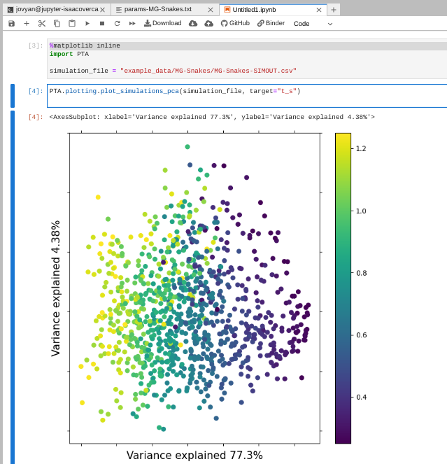
PTA.plotting.plot_simulations_pca(simulation_file, target="t_s")
NOTE: Fixing it when plots don’t show
You might see the first time you try to run a command to plot a figure that nothing actually happens. This is because plotting is a little goofy inside jupyter notebooks (for reasons that are both too boring and too complicated to go into). You can always fix this by simply re-running the cell that includes
%matplotlib inline, and then running the cell with the plot code again.
In this plot we are using Principal component analysis (PCA) which is a
standard dimension-reduction technique. Each point in the plot represents the
data from one simulation and all the points are colored by their t_s value.
You can see the points are arranging themselves in a gradient based on t_s,
and this is a good indication that the simulations ‘make sense.’ Similar values
of t_s will generate similar output data and different values of t_s will
generate different output data. This is good, it is the kind of variation the ML
inference will key in on.
Challenge: Plot the PCA with different ‘target’ parameters
Look back at the ‘parameters’ in the column header of the MG-Snakes-SIMOUT.csv file. Choose one that you think might show differences in the simulations. Try to stick with the ones in the first 11 columns as these are the ones with variation in our particular simulations. First, make sure you are clear on what this parameter means, and if you have questions talk with your partner or ask one of the instructors. Next, modify the call to
plot_simulations_pcato use this new parameter as the ‘target’. What do you see in the PCA? Is there clear separation of the simulations based on the selected target parameter? Think about why this might be. If you have more time try to find the parameter that generates the best separation in the data. What is it?
Lets quickly look at some simulations with bad parameters, so you can see what simulations look like that don’t ‘make sense’.
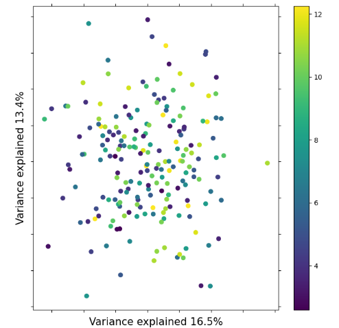
Notice here how there’s no coherence in the plot based on t_s values.
Everything is kind of all over the place. This is an indication that there
is not good information in the simulations to differentiate t_s values.
Question: Why would some parameters generate ‘bad’ simulations?
To generate these bad simulations we used very small
Nevalues with respect to the size oftau. Why would this generate simulations with no information?
ML classification
How many populations co-expanded synchronously? <- This is the motivating
question for ML ‘classification’ (or ‘model selection’ as it’s sometimes called).
In ML classification we consider a categorical target (or ‘response’) variable
and we attempt to classify which category our empirical data belongs to.
In this case our categorical target variable is zeta_e (the effective number
of co-expanding populations).
PTA includes an inference module that takes care of a bunch of the ML bookkeeping
and simplifies ML inference from simulations and empirical data. For this
exercise we’ll use a simulated mSFS with a known zeta_e value of 8, and we’ll use
the pre-baked simulation file that we already loaded in previously. In a new
notebook cell type the following commands and run it:
msfs = "example_data/MG-Snakes/sim-empirical-msfs-z_e-8.txt"
cla = PTA.inference.Classifier(msfs, simulation_file)
cla.predict()
It will think for a while and then print results to the screen. The results are a
vector of classification probabilities for each of the possible zeta_e values.
Larger values indicate higher prediction probability. Still, it’s a little tricky
to evaluate by eye.
(          zeta_e
 estimate       7,
          0    1    2     3     4     5     6     7     8     9   ...    12  \
 zeta_e  0.0  0.0  0.0  0.02  0.02  0.03  0.07  0.16  0.07  0.14  ...  0.03

           13    14    15    16   17    18    19    20    21
 zeta_e  0.04  0.01  0.04  0.04  0.0  0.08  0.07  0.03  0.02
Question: Why are these results different from yours?
In all likelihood the results you see here are different from those you will get in your own analysis. Why might this be?
Interpreting ML classification results
The vector of classification probabilities can be difficult to eyeball,
particularly when there are so many zeta_e values (the results get
truncated). We provide a solution for visualizing classification results
with the plot() function of PTA.Classifier. Open a new cell and run
the plot command: cla.plot()
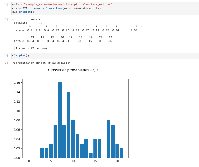
Now it’s a little easier to see there are peaks in prediction probability
at 7 and 9 with most of the weight of the prediction probability
centered around 8. Standard practice in these kinds of things is to
take the mode of the distribution as the point estimate. Using this
method we would say of these results, the most probable zeta_e for this
mSFS is 7.
Typically one would want to be more careful in drawing conclusions from this result, taking into account prediction uncertainty for example. This is something to think about, but not something we can get into detail about in this short course.
Activity: Attempt to predict
zeta_evalues for mystery simulations Time allowing, you may wish to try to classify some simulated mSFS with unknown (to you)zeta_evalues. There exists a directory calledexample_data/MG-Snakes/sim-msfs/which contains 20 mystery mSFS simulated with randomzeta_evalues. Choose one of these and in a new notebook cell try to re-run the classification procedure we just completed. The key containing the truezeta_evalues is in that same directory in the filetrue-values.txt. Don’t peek until you have a guess for your mSFS! How close did you get?
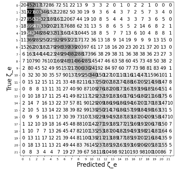
NOTE: Evaluating classification uncertainty
Collectively you may have found that some values of
zeta_eare ‘easier’ to classify accurately than others. This is because there is inherent uncertainty in the classification process, and this uncertainty is not uniform acrosszeta_evalues. In other words, somezeta_evalues are classified more accurately while others are classified with more uncertainty. We can actually systematically evaluate uncertainty perzeta_evalue using cross-validation and then plotting a confusion matrix to display the results. You can see an example of this here: ML Classification Confusion Matrix. PTA includes methods for performing this cross-validation and plotting confusion matrices, but the exploration of this is beyond the scope of this short workshop. Details may be found in the online documentation.
ML regression
When did the co-expanding populations change in size? <- This is the motivating
question for ML ‘regression’ (or ‘parameter estimation’). In ML regression we
consider a continuous target variable (e.g. t_s) and attempt to estimate
the value of this target variable that is most probable given the empirical data.
Note: The simulated t_s value for the sim-empirical-msfs-z_e-8.txt was 0.398.
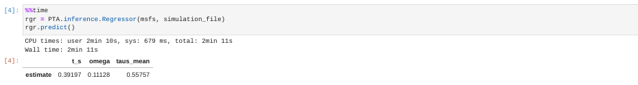
%%time
rgr = PTA.inference.Regressor(msfs, simulation_file)
rgr.predict()
NOTE: jupyter notebook magics -
%%timeThe first line of the last set of commands (
%%time) is a magic command inside jupyter notebooks which tells it to tell you how long it takes to run the commands inside this cell. This ‘magic’ has to be the first line in the cell and when you run the cell it’ll time everything that happens within it and report the resulting time after it finishes. Magic!
Interpreting ML regression results
The predict() function returns point-estimate predictions for three key
model parameters:
t_s- The time of synchronous demographic change.omega- The index of dispersion (we won’t talk about this right now).taus_mean- The average time of demographic change for all other populations.
Focusing on t_s: first of all it looks pretty good considering the small number
of simulations we are using and the fact that we didn’t do any of the fancy ‘tuning’
to improve ML performance. Next, again you will probably see your estimate is slightly
different than the one shown above. This is for the same reason as the differences in
zeta_ classification probabilities above, i.e. there is stochasticity within the
ML learning process.
This stochasticity implies that our point estimate should involve some uncertainty,
again just like above in the classification process. The ML predict() function
gives us an estimate, but how much uncertainty is there in this estimate? In a
frequentist or Bayesian context we would be able to derive a 95% confidence interval
(or HPD in the Bayesian case). With ML it’s not so straightforward. We might perform
quantile regression to get a sense of variability in the estimate, but that is
beyond the scope of this brief workshop.
NOTE: Evaluating regression uncertainty
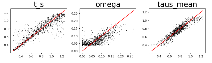
Again, we can evaluate uncertainty in our parameter estimates by using cross-validation and then plotting the true vs predicted values to display the results. You can see an example of this here: ML Regression Cross-validation. Think of this as like running
predict()on simulations with known parameter values over and over and over again, and looking at how ‘good’ the predictions are in an aggregated sense. You can do this cross-validation in PTA, but we’re not going to do it right now for lack of time. Details are in the online documentation.
Looking at the regression cross-validation plots, the take-home message here is: parameter estimates are pretty good and seem pretty reliable for the given set of parameters used to generate these specific simulations.
Activity: Attempt to predict
t_svalues for mystery simulations Returning to the mystery simulations inexample_data/MG-Snakes/sim-msfs/, thetrue-values.txtfile also records the knownt_svalues for each of the simulations. Choose one of these and in a new notebook cell try to re-run the regression procedure we just Don’t peek until you have a guess for your mSFS! How close did you get?
Running PTA on your own data
Ok, now you have seen what we can do with PTA. The next obvious question is “How do I run this on my own data? Unforutnately it’s a little tricky at the moment.
What data do you need:
- SNP data in vcf format
- A file assigning individuals in the vcf to ‘populations’
What you need to do:
- Run easySFS to generate one SFS per population.
- Import all these into PTA to generate an mSFS using
PTA.msfs.multiSFS
There’s an example jupyter notebook of how to do all this in the PTA github repositry. The simplest thing would be to copy this notebook and modify it for your own data.
The most important thing to remember in switching to analysing real data is: Everything always work better with simulations! :) Remember this when you are working with real data, and keep your expectations reasonable. Real data certainly doesn’t conform to the simple model of PTA, so this will compound the uncertainty in your ML inference. But this is the data and the model that we have, and we can only “give the data a break” and do the best we can. :)